Propeller Warning Labels Seen at the 2013 Tulsa Boat Show
We attended the 2013 Tulsa Boat Show on Wednesday afternoon January 30, 2013. Following up on our 2012 post on Propeller Warning Labels at the Tulsa Boat Show, once again, Lora and I walked around and photographed propeller warning labels / decals. Once again we were surprised at the variety of decals and warnings.
Lora quickly noted we were seeing a lot more decals at the stern than at last years show. While some boat still had no labels of any kind at the stern, many boats had numerous warning labels displayed.
While we plan of further discussing the trend in a separate post, rearward facing seats at the swim platform were almost ubiquitous on large and midsize boats. Many of those vessels have a decal / warning label telling you not to ride in those seats when underway or when the engine is running.
We also plan to create a separate post on the industry’s continued disregard for the ANSI Z-535 warning standard. While many boats, drives, and accessories (especially wake boarding accessories) screamed their styling influences, it is obvious those talented individuals were not assigned to designing ANSI Z-535 warning labels. Few if any warning would actually meet the standard and we saw some labels/warnings that were obviously a last minute thought.
In addition to propeller warnings and rearward facing seat warnings, many boats now have one or more fueling warnings at the stern AND many now have a “No E-15” warning at the stern as well. Among other labels we saw back there were “Made in the USA”, NMMA Certified, carbon monoxide warning, trademarks and patented stickers, check outboard mounting bolt tightness, swim platform warnings, ladder capacity warnings, toe eye notice, falling warnings, don’t step here warnings, water jet outlet and intake warnings, warning to read the manual and instructions, power steering warnings, ethanol warnings (E-85), ladder use warnings, and a warning against over trimming or tilting.
We also noted the comical placement of some labels (impossible to view when you need to heed them).
The comments below are our quick observations of some of the variety seen in propeller warning labels at a single boat show. Our comments also identify some of the challenges specific warning labels have with ANSI Z535.4 – 2011 (the American National Standards Institute warning standard). Note, the industry may claim ABYC T-5 Safety Signs and Labels applies. ABYC’s web site says it was last revised in 2002. The January 15-16, 2013 ABYC PTC Meeting minutes report Product Technical Committee discussing the status of T-5. It opens with, “Is this standard still relevant?”
Although we also saw several propeller warning labels identical to the ones we saw at the 2012 Tulsa Boat Show, we did not rephotograph them. The only ones we show below are those new to our sample of propeller safety related labels in 2013.
We will briefly discuss the warning standard (ANSI Z535.4), begin with the propeller warning labels, then move to other warnings that are also relevant to propeller safety.
ANSI Z535.4 Warning Standard
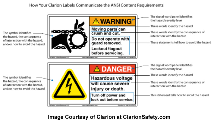
For those not familiar with ANSI Z535.4 it is the standard commonly associated with 3 panel warnings such as those displayed below.
We continue to call for the industry to follow this standard. The standards come from a committee that was originally formed in 1979, yet the boating industry still does not apply it.
As one of our commenter’s points out below, one of the goals of ANSI it to condition people to respond to the same warning across all kinds of devices and machinery. Sort of a “Pavlov’s Dog” approach. If people understand the basic symbols and warning from one field (like their riding lawn mover, tractor, or chain saw) they will recognize similar warnings on their boat and know how to respond.
While the ANSI warning standard is highly detailed, the basics are shown in the example furnished by Clarion above.
PLEASE NOTE –
Our comments below are NOT professional advice. If one of the labels we discuss below is yours, we suggest you receive professional assistance in making sure it complies with ANSI Z535.4 -2011 or you have justifiable reasons for not complying.
We make several comments below about how the warnings below differ from ANSI Z535.4 standards. The standard itself provides some leeway for specific applications, situations, and needs. It is possible the designers of some of the warnings below considered the standard and had some justifiable reason for deviating from it. However, we suspect that in not the case in most of the examples below.
Plus we are only listing some of the major problems the warnings have with the standard. As mentioned earlier, the standard is highly detailed. If anyone elects to rework their warning labels based on the comments below we suggest you receive professional assistance in coming in compliance with some of the more minor issues at the same time.
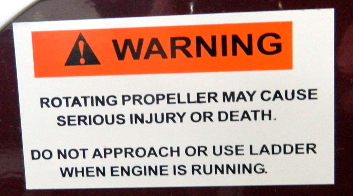
This warning has no borders, is all caps (text is to be in upper and lower case except for specific situations such as very short messages, or to emphasize a specific word or phrase), and the warning background is almost red instead of burnt orange. No graphic symbol panel is provided, the text is centered (is supposed to be flush left and ragged on the right).
While symbol panels are not required, their use is encouraged to communicate part of or all of the message panel.
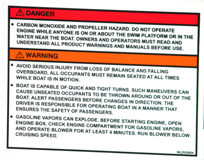
An example of a warning for multiple hazards. The standard says if you put multiple hazards on the same label, you should only use one Signal Word (Danger, Warning, Caution). The signal word you select should be for the maximum one you would have used for any hazards on that warning. For example, this decal has Danger and Warning on it. Per the standard, there would just be the Danger signal word and all the hazards would be listed and dealt with under that one signal word.
The message panel is in all caps.
The text under the Danger signal word in this example (the carbon monoxide and propeller hazard) tries to combine two hazards and does not tell you what can happen to you (does not say can cause serious injury or death). It also tells operators to read and understand all warnings and all manuals prior to use. It would be interesting to survey their customers and see if they could find anybody that did that.
Two hazards they identify under the Warning signal word have propeller safety applications (falling overboard and being ejected in turns).
No symbol panels are used.
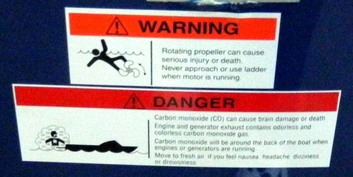
This boat propeller warning does not have an outside border. It does use upper and lower case text. It does include the use of a symbol panel, but the symbol panel shows a propeller out there where the fish are, in no relationship to the boat or marine drive.
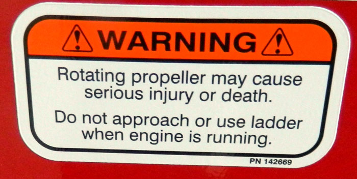
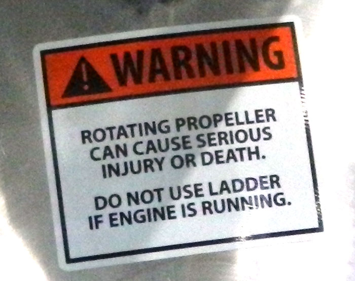
Propeller warning tells you not to approach the ladder but does not say anything about approaching the drive or propeller. It does use upper and lower case text, but centers the message panel.
It, like several other examples at this show, uses two Alert symbols (the triangle with the exclamation mark). It puts one on both sides of the Signal Word. That does not conform to ANSI Z535.4 standards.
The alert symbols are open triangles. While this is acceptable by the standard, it is generally used for international applications. We think it best to stay with the black triangles when possible for U.S. applications.
The rounded corners of the panels are not recognized by ANSI Z535.4
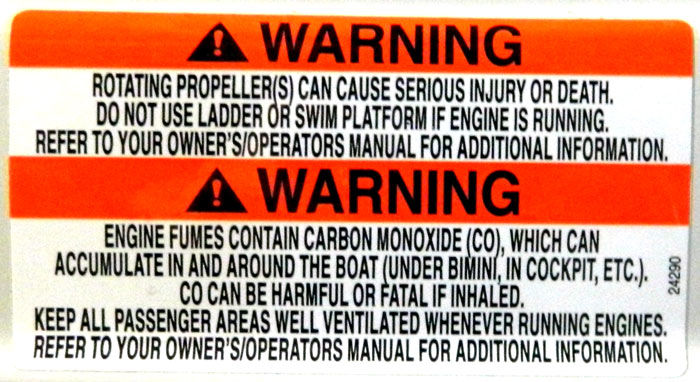
Another multiple hazard warning. Per the standard if both the warnings use the same Signal Word (they both use warning in this instance), you only use one signal word panel. The label should only have one Warning signal word panel not two.
The message panel text is centered (should be left justified).
All caps and no borders.
No symbol panel is used.
The standard talks about text leading (the space between letters) and font selection. The individual letters in this message text look a little tall and pretty close together making them even harder to read than normal all caps text.
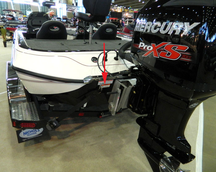
We also observed several propeller warnings placed in locations that would be very hard to view from the boat or water, and in locations that if you got close enough to read them, you would be in the hazard zone they are telling you to avoid.
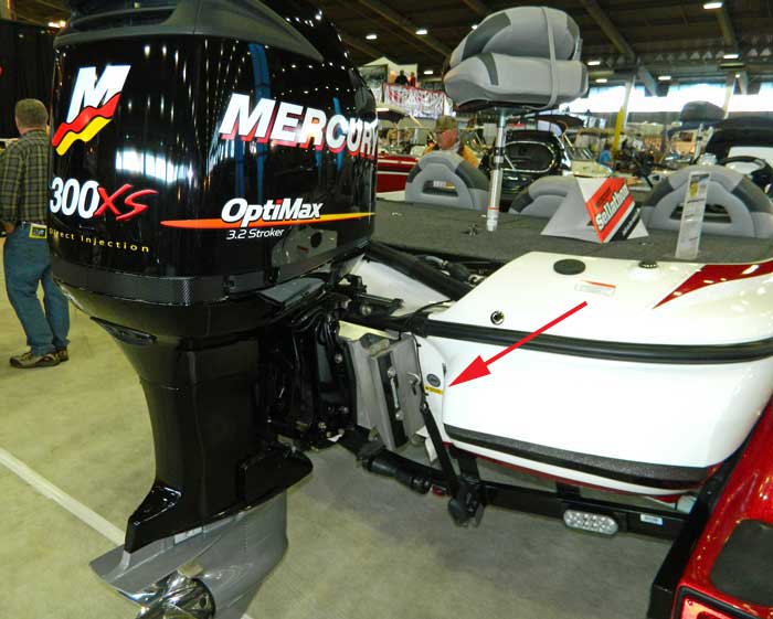
The propeller warning above is an example. It is below a Carbon Monoxide warning, on the outside of the transom up close to the outboard jack plate.
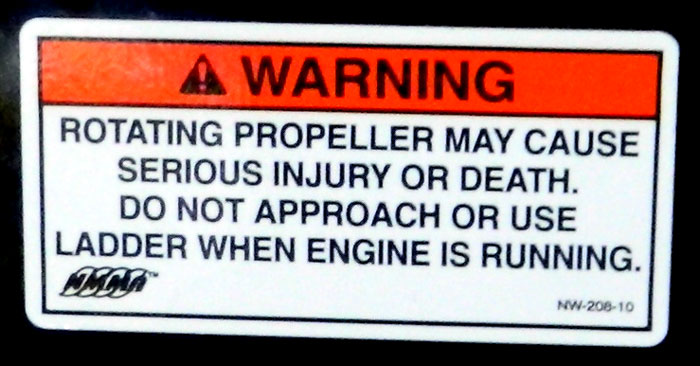
The National Marine Manufacturer’s Association (NMMA) version of a propeller warning. At one time we thought NMMA certified boats were to use these decals, but now we are not sure.
NMMA used all caps and centered the message, both are against the ANSI Z 535.4 standards. Plus they do not include a symbol panel.
The rounded corners are a nice touch.
NMMA often says we don’t need propeller guards, warnings are sufficient. We find it interesting NMMA’s own warnings do not comply with the standard.
Plus their choice of signal words is debatable. Danger for “will cause”, Warning for “may cause”. Approaching a running propeller in reverse from the rear “will cause”.
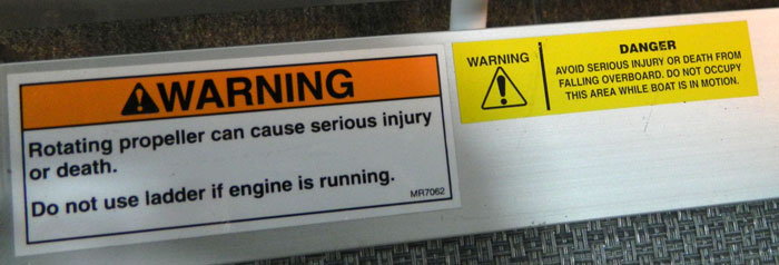
Traditional propeller warning accompanied by a yellow falling overboard warning. The yellow warning has no borders, is yellow in the message text area, the text is centered, and the message is in all caps. All of these are against the teachings of ANSI Z535.4.
The choice of Signal Words is interesting. The propeller warning label uses “Warning”, while the Falls Overboard warning uses uses exactly the same language “serious injury or death” but uses the signal word “Danger” above its message.
The yellow warning begins with “Avoid” rather than identifying the hazard or telling us how to avoid it.
On a closer look, the yellow warning actually uses two signal words. “Warning” is above the alert symbol (triangle with the exclamation mark in it), but “Danger” is above the message. It looks like “Danger” is bolder than “Warning”.
Whatever they had in mind, the yellow warning has serious problems with ANSI Z535.4. Their intent might be able to be worked into the propeller warning decal beside it.
Plus they should spend some time making sure they picked the right signal word (Warning vs. Danger) on the propeller warning to the left.
Plus the boat would look much nicer if the warnings were consistent (looked reasonably alike).
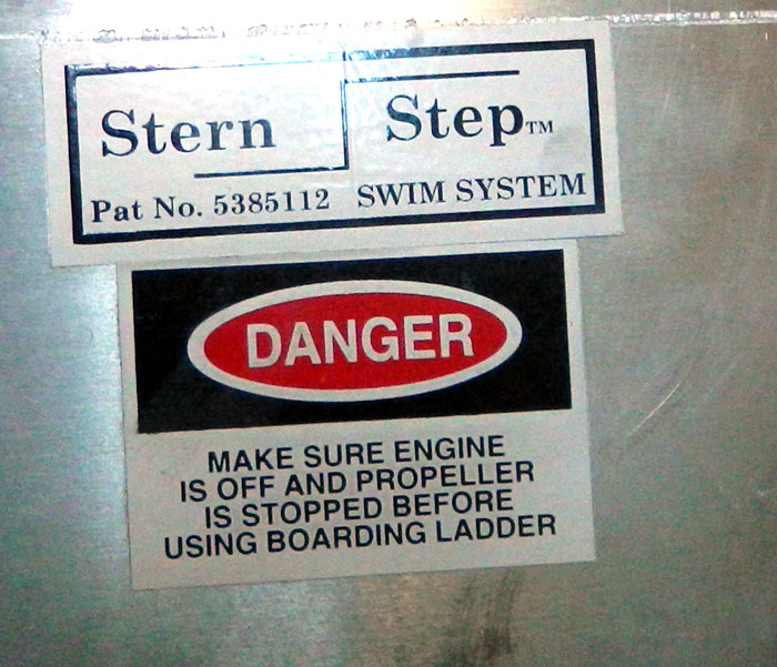
Propeller warning on a pontoon boat pontoon along with a decal indicating the step has been trademarked and patented.
Danger, the Signal Word is in a red ellipse instead of the signal word panel. The message text is in all caps and centered.
The label does not explicitly identify the hazard, plus it does not tell you what can happen to you.
We found it interesting that it was place below the Stern Step trademark and patent decal, as if it were less important.
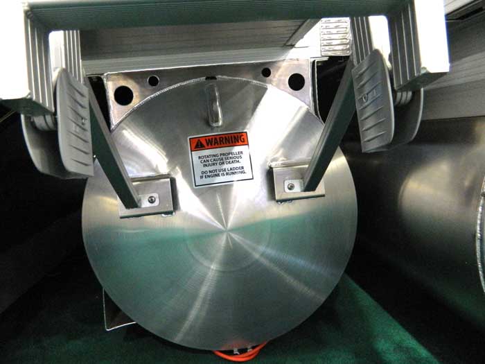
Another pontoon boat propeller warning mounted on a pontoon. The text is in all caps and text in the message panel is centered.
Like many of the “ladder” warnings, it tells you not to use the ladder if the engine is running, but does not explicitly tell you to stay away from the propeller when the engine is running.
The warning above is mounted to the aft of a pontoon which is common on pontoon boats. Its mounting position is better seen in the image below.
We suggest pontoon mounted warnings may not always be highly visible in the water, especially not if you pull the swim ladder down between you as them as this model does.
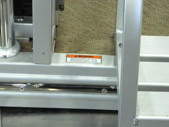
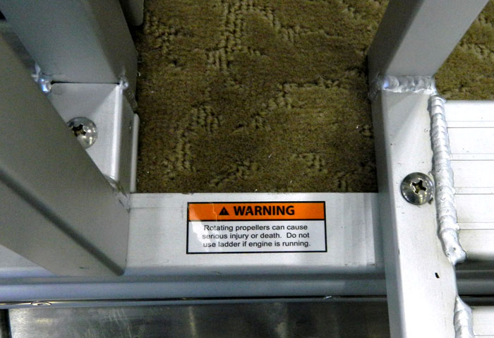
We also found this propeller and ladder warning and its mounting to be very unusual. The decal is extremely small. It is almost dwarfed by the small screw to its right. In addition it is recessed down in a hole between a swim ladder and a brace for the swim gate on a pontoon boat.
Even if you could somehow justify putting it down in that hole, you could at least make it a little bigger. it does not even take up all of the little amount of space available down there (it could be both wider and taller).
Its choice of words “do not use ladder” might be improved to “do not approach ladder” as many people near the ladder are pulled into propellers.
The next two images better indicate the placement of this boat propeller warning.
Placement of pontoon boat propeller warning at 2013 Tulsa Boat Show viewed from a little further back
In this image above, you can better begin to see the structure of the swim ladder and the railing near the boat propeller/ladder warning.
Its easy to imagine a little dirt, grim, and slime getting down in there and making the warning unreadable after some use.
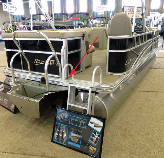
Placement of propeller warning decal on pontoon boat at 2013 Tulsa Boat Show viewed from a distance.
In the final image above you can see where the propeller warning is in respect to the pontoon boat. It down in between the swim ladder and some bracing for the swim gate.
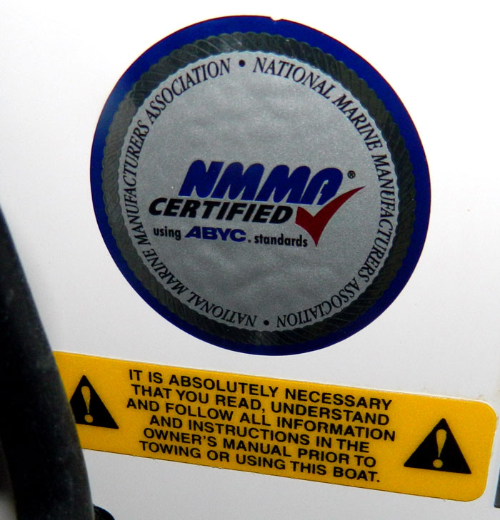
NMMA Certified label along with with a warning to read to read, understand, and follow the information and instructions in the owners manual prior to towing or using the boat.
While we understand at least part of the intent of the message, the warning itself follows almost none of the ANSI Z535.4 layout. It has no panels, two alert symbols (triangle with the exclamation mark inside it), the message is all caps, there is no Signal Word, the message is centered, the color does not look like any of the standard colors (but is sort of yellow which goes with Caution), and the aspect ration (height to length) is highly unusual as the decal is long and thin with no apparent reason of why it needs to be so.
Additionally, the reference to “towing” is a bit confusing. Does it refer to towing this boat, using this boat to tow another boat, or using this boat to tow a person with a rope?
What makes it even more interesting is the placement of the warning next to the NMMA Certification label (hinting that NMMA approved this label) AND the position of both these labels on the boat as seen in the photo below.
As you can see above, the label telling me to read, understand, and follow the operators manual before I operate the boat is on the outside of the transom jammed up close to the outboard jackplate. Not exactly at the helm.
I also found the “It is absolutely necessary” prefix a bit interesting.
This label and its placement was probably the most bizarre warning we observed at the show, in terms of compliance with ANSI Z535.4 and its placement on the boat.
Yamaha’s bilingual warnings to read the owners manuals and warnings was stuck directly on the side of an outboard. It also tells us to wear a PFD, and a kill switch lanyard. While all good advice, and it looks like an ANSI Z535.4 warning from across the street, up close it only has one symbol (probably the manual) and does not explicitly explain what can happen to us if we do not follow those instructions.
ANSI Z535.4 provides a format for including multiple symbols for multiple warnings on the same label. Plus the standard calls for bilingual warnings to be on the same label, not on two separate labels as seen here. It actually provides three different formats for bilingual labels.
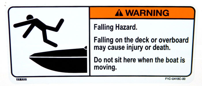
While this Yamaha Falling Hazard warning at least looks like a ANSI Z535.4 warning, the message text is a bit confusing, especially when viewed with the symbol panel. The text talks about falling on the deck while the symbol shows somebody doing a gainer off the bow.
The text says don’t sit here. The warning would be behind your shin if you were setting on their rearward facing seats with your feet on the swim deck of one of their water jet boats. You could not set on that surface. The intent seems to be don’t set on the seats when underway? Or maybe it means don’t set on the swim deck?
So they warn you against falling on the deck, they show you somebody falling off they bow, and they put the label at the stern?
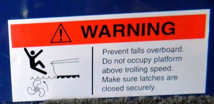
Another warning not to fall. This one has no border around its perimeter. It shows a propeller detached from and perpendicular to the boat. The message text does not tell you what can happen to you (probably serious injury or death).
2/5 of the message (two of the five lines) tells us to makes latches are closed securely. From the decal itself we have no idea what that is about or what can happen to us. We are guessing their might be some recessed compartments in the deck, that if we don’t shut them securely, we might trip over them. From the carpet, the boat color, and the photo number, I think this was a bass boat.
The text is a bit interesting, it opens with “Prevent falls overboard” vs.something like Yamaha did in the warning above this one. We are instructed to begin with identifying the hazard except in certain situations where the advice on how to avoid the hazard is more important to be rapidly communicated. “Prevent” does neither.
Plus they show a propeller out there where the fish are (in no relationship to boat or marine drive).
The Signal Word panel color looks pretty red compared to the burnt orange it is supposed to be. Our image processing methods may not have faithfully reproduced its color, but it still looks pretty red to me.
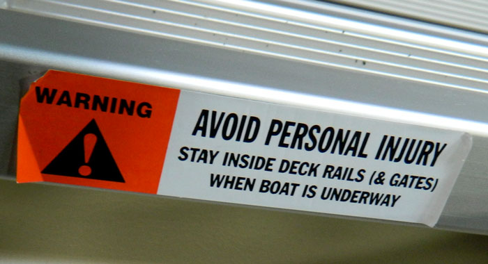
The very narrow warning caught my eye as I was walking by a pontoon boat. It was up on top of one of rails. While eye catching, it has no borders, puts the signal word (warning) above the alert symbol (triangle with exclamation point in it), uses all caps, and does not explicitly explain the level of injury I might suffer if I do not obey it (only says “avoid personal injury).
Plus the condition of warning is already in question and the boat is still in a boat show (has not been in use). One corner is ripped off, one corner is pulling up, one whole end (the white end) is peeling back.
While I am often guilty of over using parenthesis, even I am not sure why this warning has parenthesis around “& gates”.
Plus the text was in position to be read by me walking past the boat when it is resting on its pontoons on a cement floor. People on the pontoon boat would have to read it upside down. Maybe they think you are supposed to read it from the dock before you board?
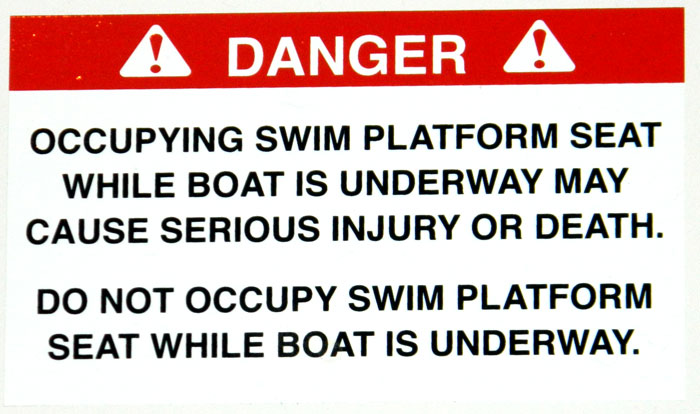
One of several rear facing seat warnings we observed at the 2013 Tulsa Boat Show. The seat faces the swim platform and has no rail between the passenger and the water. The warning has no borders, uses all caps, and centers the text.
They elect to use Danger as their signal word, while most propeller warnings use Warning as the signal word.
By definition in the standard, Danger is used when the hazard WILL cause serious injury or death if you do not take the appropriate action, this warning uses the phrase “may cause serious injury or death”.
The warning label does not include a signal panel and uses two alert symbols (triangle with exclamation mark), you are only supposed to use one.
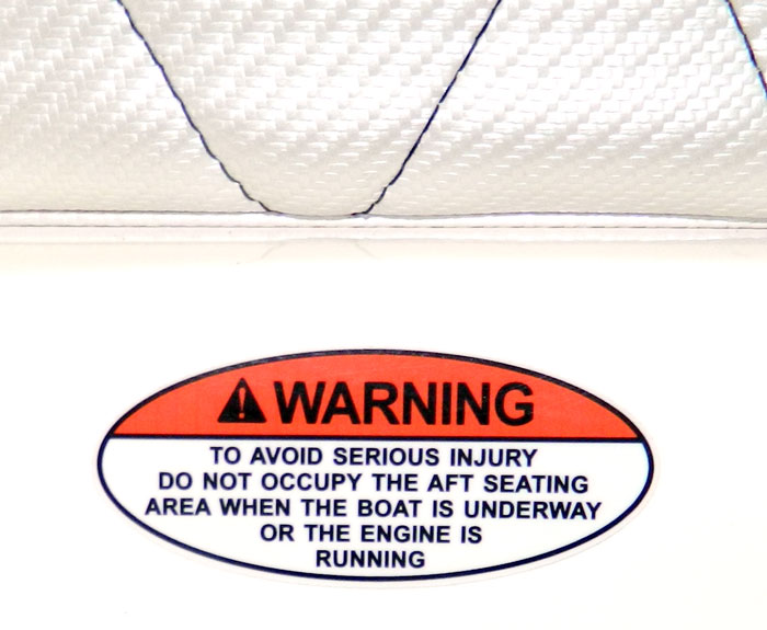
Another rearward facing seat warning seen at the boat show. This one is elliptical. While it may be eye catching, elliptical formats are not expressly recongnized by ANSI Z535.4. However, the standard does say panels may be non-rectangular to make good use of the available space. The choice of elliptical shape in this instance does not appear to have been space driven.
It uses all caps, centered text, and does not explicitly explain what may happen to me (serious injury or death, caught in the propeller, drowning, hypothermia, struck by another boat after I fall out, etc). It does not utilize a signal panel.
This boat manufacture thinks “warning” is the appropriate signal word for rearward facing seats, while the boat manufacturer above this one thought “Danger” was the correct signal word.
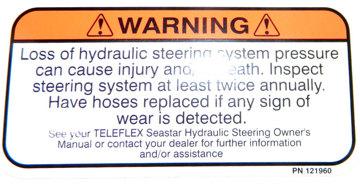
Teleflex power hydraulic steering warning. It tells us that loss of power steering pressure can cause injury or death. I realize what they are talking about (loosing pressure causes the boat to lose steering, then the boat spins or crashes into something). I come from a hydraulics background used to seeing warnings about how high pressure leaks can cause serious injuries, now we read loosing pressure can cause the same thing.
The warning uses centered text and has no signal panel.
The panels have rounded corners. These are not addressed in the standard.
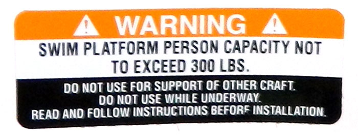
This warning indicates the load capacity of the swim platform. At only 300 pounds, its no fat boys allowed. It also tells you not to use it (which we interpret as do not be on it) while underway. The message might have been clearer with “do not occupy when underway” or “do not occupy underway”.
The label includes 2 alert symbols (triangle with the exclamation mark in it) which is in violation of ANSI Z 535.4. It uses all caps and centers the text both of which are also against the guidelines of the standard.
While the standard does allow for white text on black backgrounds when needed for standing out against certain backgrounds, this warning label has a white strip and a black strip, some not approved by the standard.
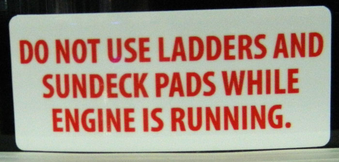
This warning looks like one of those last minute thoughts on the way to the boat show. It has no alert symbol, no Signal Word panel, no borders, uses all caps, centered text, red text, and in no way looks like a ANSI Z535.4 warning label.
It look more like something they stenciled on white backing to tell me to take my shoes off before I board their boats at the boat show.
At any rate, having exhibited at other shows we recognize how hard it is to get ready for a boat show. We appreciate all the exhibitors that came, and wish them well. We hope they received lots of sales from their efforts at the Tulsa Boat Show and those from out of state enjoyed their time in Oklahoma.
If you found our coverage of warning labels at the 2013 Tulsa Boat Show interesting, you might be interested in our similar coverage of warnings at the 2012 Tulsa Boat Show.

Gary – You did a nice job pointing-out the inconsistencies in label design. It should be noted that ANSI Z-535 is attempting to standardize the format of warning messages to condition users to respond to the same signal words regardless of product or industry. Sort of a “Pavlov’s Dog” conditioned reflex.
For exporters, it should also be noted that ANSI style labels, by themselves, do not meet EU ISO requirements. While it is possible to harmonize an ANSI-ISO hybrid label, the resulting label would not meet the full requirements of either standard.
Thanks for your comment, John. Your “Pavlov’s Dog” comment is an excellent point. ANSI is trying to extend what people learn from one situation to another.
And yes, we have seen the hybridization issues and some attempts to use multilingual warnings as well. I have been followed some international harmonization issues in other fields and they seem to take decades to resolve. We hope things move faster on this one.
Thanks again for your comment.
gary polson