Worst Boat Propeller Warning Ever: nausea category
Over the years we have seen many boat propeller warnings that were not as effective as they should have been for all kinds of reasons. Over the last 40 plus years I have looked at thousands of warnings on many kinds of equipment and none of them have ever made me sick.
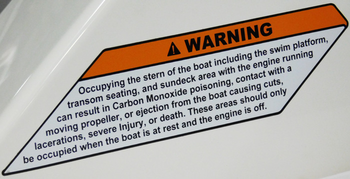
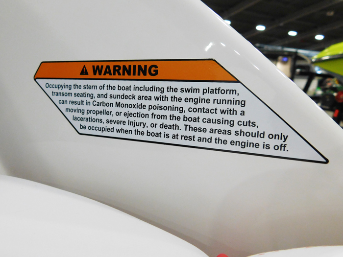
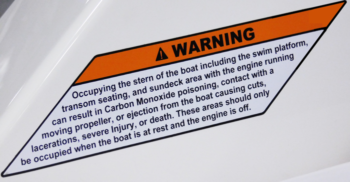
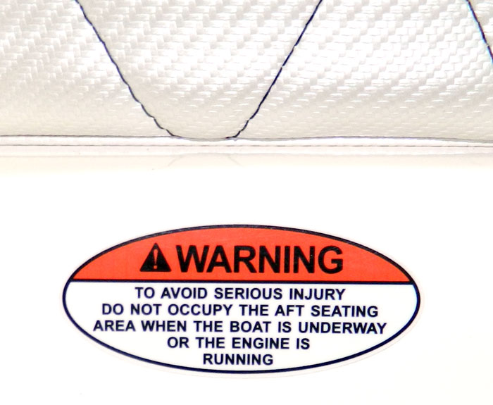
All that changed Friday 3 February 2017 when we walked the Tulsa Boat Show and my eyes encountered the warning below.
Just attempting to read the warning while the boat was sitting on the trailer made me nauseous. I called Lora over to try to read it, she looked at it and turned toward me with a very perplexed look on her face.
Wearing bifocals may exaggerate the impact of viewing the warning, but its tilted tile design along with its length, and the ends of the warning / signal word portion of the warning not being parallel with each other, and the white background on a white boat combine into something very disturbing to me, even when just viewing the image above.
To me, the warning has a bit of a reverse Star Wars intro feel to it (when the animated text is scrolling). To me it feels like the text on the warning is falling down and away from me as I read it instead of scrolling up and away like it did in Star Wars.
For those who struggle reading the warning as I did, I copied the text below.
“Occupying the stern of the boat including the swim platform,
transom seating, and sundeck area with the engine running
can result in Carbon Monoxide poisoning, contact with a
moving propeller, or ejection from the boat causing cuts,
lacerations, severe injury, or death. These areas should only
be occupied when the boat is at rest and the engine is off.”
A close look at the orange Warning signal word portion of the warning gives the appearance of a mobious strip. It is like there is a twist in the orange section between the left and right ends giving it a 3D appearance.
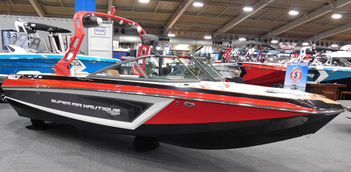
The boat itself is a nice bright red color.
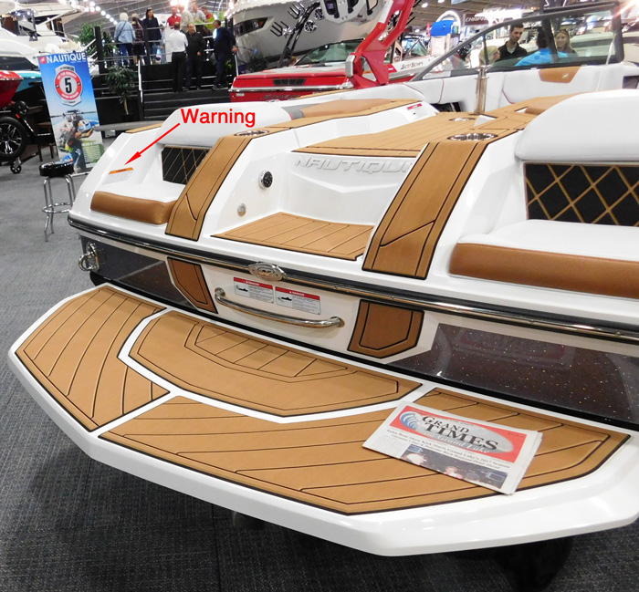
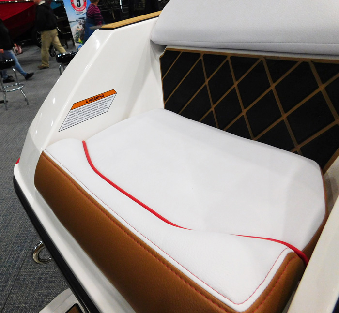
A view of the stern is below.
You can begin to see the warning in the image below.
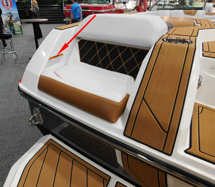
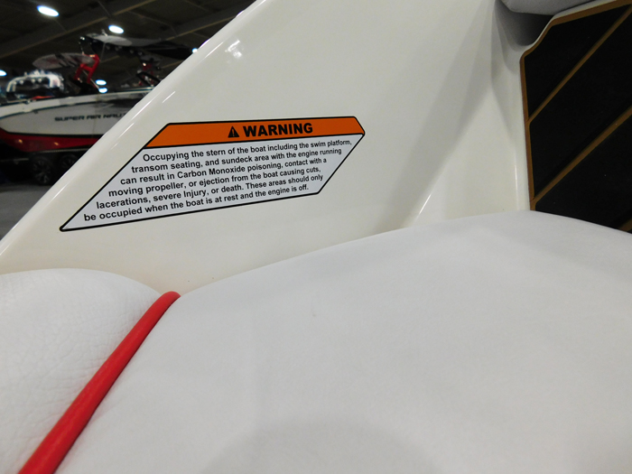
A view of the warning by the seat is below.
An even closer view is below.
A view of the similar warning on the port side is below.
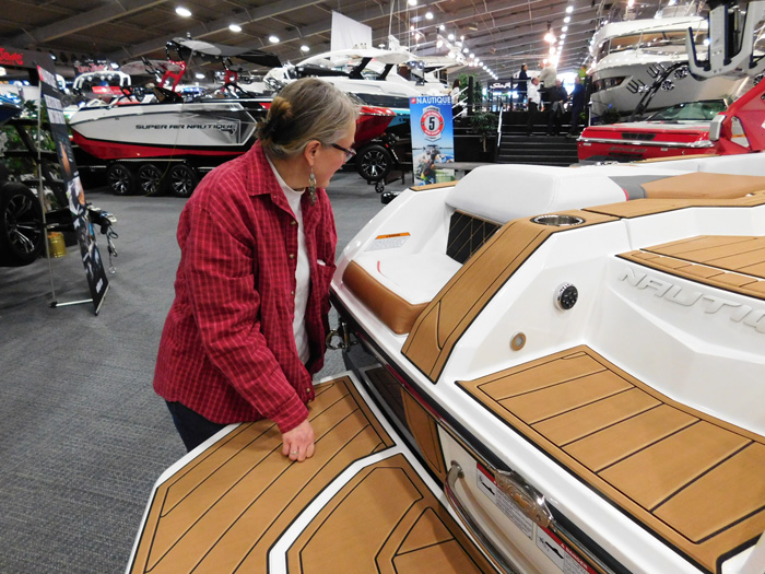
If it is difficult trying to read the warning with the boat sitting still on a trailer, its only going to get worse bouncing around on the water. As to reading it from a trailer, the height is not very good for that either as seen in the image below.
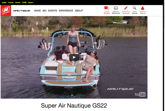
Beyond the readability issues, placement of this warning comes up short. If you are setting in the seat, its pretty hard to read the warning. If you are entering the water from the boat or the boat from the water, you are likely going though the middle of the boat, too far away to read the warning. The image below was captured from Nautique’s web site 6 February 2017.
Some alternative approaches:
Alternative #1
We tried altering the top right corner of the “Warning” signal word portion of the warning to have parallel sides as seen below.
Even with parallel sides, the warning is still rough on me. It even looks a little like something a Ninja might throw at you.
Alternative #2
Why do they use angled sides anyway. There is plenty of room to stick a normal rectangular warning label on there. My guess is they do it for (1) esthetics, (2) to make it harder to read, or (3) to make it less visible. Boat builder’s don’t like to warn about the dangers of their boats or the hazards of boating in general, but they do want to legally cover their butt in case something goes wrong.
Lets give Nautique the benefit of the doubt and say they chose the non-rectangular warning for esthetics.
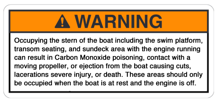
I created a more traditional rectangular warning using the same text for comparison.
Even the rectangular version is hard to read because it has so much text and no graphics.
Alternative #3
As to the intent of the warning, they are telling you it is dangerous to be at the stern of the boat (including the swim platform, transom seating, and sundeck area) unless the boat is at rest and the engine is off.
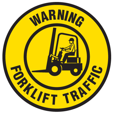
They could put large stickers in the bottom of the seats like the forklift traffic warning below.
Emedco sells their forklift traffic warning in sizes up to two feet in diameter.We saw the aft facing seat warning below at the 2013 Tulsa Boat Show. Changing its message panel text to mixed upper and lower case would make it easier to read. Combining it with some attributes of the Forklift warning above (including a graphic) might generate a large warning that could be placed in the seats.
Alternative #4
They could rewrite, reshape, include a pictograph, and re-position a more effective version of their existing warning.
Alternative #5
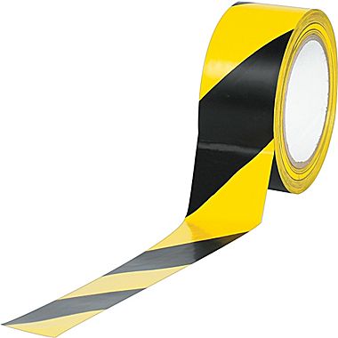
Just offhand, we like the idea of sticking yellow/black stripe warning tape to the top of the backs of the seats and continuing the tape line across the floor. A warning to not occupy the boat behind the tape when the engine is running could be imprinted in the tape at desired locations. The image below shows a traditional yellow/black roll of safety tape available from Staples. The tape or whatever similar product was selected for that message would need to remain stuck on, colorfast, and readable in the marine environment.The safety tape line approach would likely be more effective with at least one other warning explaining the hazards and risks in greater detail in a readable position on the vessel.
Alternative #6
Do something like Brunswick’s Moving Propeller Alert (blinking rotating LED lights indicate the engine is running). This could be a nice touch on wake board boats where sound systems often drown out engine noise. The rotating LEDs would warn everybody to stay free of the aft facing seats, swim platform, sundeck, and transom area. It would likely require more than one set of lights to do that.
A word about Nautique – my comments only address this warning label. Nautique obviously makes high quality, innovative, great looking ski and wakeboard boats. We wish them the best and laud their continued innovation.
If you agree or disagree with my review of this warning, or have other alternative to suggest, we welcome your comments below. Please be polite.
